Final Project: Methods
The following is a final project from a class on data visualization in R. I chose to remake and improve several graphs from EveryStat.org on gun violence in Oregon, using the same data.
Data source & background The data for this project was obtained from the organization Everytown for Gun Safety, which is the largest gun violence prevention organization in the United States. Their website EveryStat.org contains interactive dashboards with statistics on gun violence broken down by state, race/ethnicity, and gender, as well as individual state-level statistics with charts and graphs.
The data they used for their visualizations was based on 2012-2021 and was collected from federal agencies such as the Centers for Disease Control (CDC) and the Agency for Healthcare Research & Quality (AHRQ). They also obtained data from external researchers for certain subjects on which the federal government did not release data. The data on which their visualizations are based are freely available on their website (for time periods from 2013-2022).
State-level data was shown with bar charts, line graphs, and pie charts, yet I found each of those to have several problems based on what we have discussed in class. For my final project, I decided to remake three of the charts/graphs based on Oregon data and improve and update them based on what I’ve learned in this class.
Target audience The target audience for this website, and my visualization, is the general public in the United States. They don’t have to have any particular familiarity with the field, or any special training in statistics.
Load & wrangle data
# demographics
demo <- read_excel(here::here("data/demographics.xlsx"),
                            sheet =1,
                            skip=8,
                            na = "NA", .name_repair = make_clean_names)

# economic cost
cost <- read_excel(here::here("data/economic_cost_gun_violence.xlsx"),
                            sheet =1,
                            skip=8,
                            na = "NA", .name_repair = make_clean_names)

# IPV
ipv <- read_excel(here::here("data/ipv.xlsx"),
                            sheet =1,
                            skip=8,
                            na = "NA", .name_repair = make_clean_names)

# nonfatal
nonfatal <-read_excel(here::here("data/nonfatal_gun_injuries.xlsx"),
                            sheet =1,
                            skip=8,
                            na = "NA", .name_repair = make_clean_names)

# state overview
overview1 <-read_excel(here::here("data/state_overview.xlsx"),
                            sheet =1,
                            skip=8,
                            na = "NA", .name_repair = make_clean_names)
nrow(overview1)
## [1] 52overview2 <-read_excel(here::here("data/state_overview.xlsx"),
sheet =2,
skip=8,
na = "NA", .name_repair = make_clean_names)
nrow(overview2)## [1] 313overview3 <-read_excel(here::here("data/state_overview.xlsx"),
sheet =3,
skip=8,
na = "NA", .name_repair = make_clean_names)
nrow(overview3)## [1] 1560# transgender
trans <-read_excel(here::here("data/transgender.xlsx"),
sheet =1,
skip=8,
na = "NA", .name_repair = make_clean_names)
# youth
youth <-read_excel(here::here("data/youth.xlsx"),
sheet =1,
skip=8,
na = "NA", .name_repair = make_clean_names)overview3 %>% filter(state=="Oregon") %>% glimpse()## Rows: 30
## Columns: 6
## $ state <chr> "Oregon", "Oregon", "Oregon", "Oregon", …
## $ year <dbl> 2013, 2013, 2013, 2014, 2014, 2014, 2015…
## $ injury_intent <chr> "All Firearm Deaths", "Firearm Suicide",…
## $ total_deaths <dbl> 462, 389, 61, 497, 422, 69, 486, 373, 10…
## $ population <dbl> 3930065, 3930065, 3930065, 3970239, 3970…
## $ age_adjusted_rate_per_100_000 <dbl> 11.03426, 9.18615, 1.56734, 11.65510, 9.…# how many years?
overview3 %>% filter(state=="Oregon") %>% dplyr::distinct(year)## # A tibble: 10 × 1
## year
## <dbl>
## 1 2013
## 2 2014
## 3 2015
## 4 2016
## 5 2017
## 6 2018
## 7 2019
## 8 2020
## 9 2021
## 10 2022# injury intent
overview3 %>% filter(state=="Oregon") %>% dplyr::distinct(injury_intent)## # A tibble: 3 × 1
## injury_intent
## <chr>
## 1 All Firearm Deaths
## 2 Firearm Suicide
## 3 Firearm Homicide (including Legal Intervention)# wrangle data
overview3 <- overview3 %>%
mutate(injury_intent=as.factor(injury_intent)) %>%
mutate(injury_intent=fct_recode(injury_intent,
# new name= old name
"Suicice" = "Firearm Suicide",
"All" = "All Firearm Deaths",
"Homicide" = "Firearm Homicide (including Legal Intervention)"))
overview3 %>% filter(state=="Oregon") %>% dplyr::distinct(injury_intent)## # A tibble: 3 × 1
## injury_intent
## <fct>
## 1 All
## 2 Suicice
## 3 Homicideoverview3 <- overview3 %>% rename(adjusted_rate=age_adjusted_rate_per_100_000)
overview_or <- overview3 %>% filter(state=="Oregon")
overview_or <- overview_or %>% filter(injury_intent!="All") Visualization 1: line graph
The previous visualizations I choose to remake were 1) a line graph, 2) a bar chart, and 3) a pie chart/ donut hole chart. The first figure was a line graph (Figure 1). The problems I noticed about this graph were as follows: first, there is no clear story. When I look at the graph, there is nothing preattentional; I don’t immediately know what the take-away is.
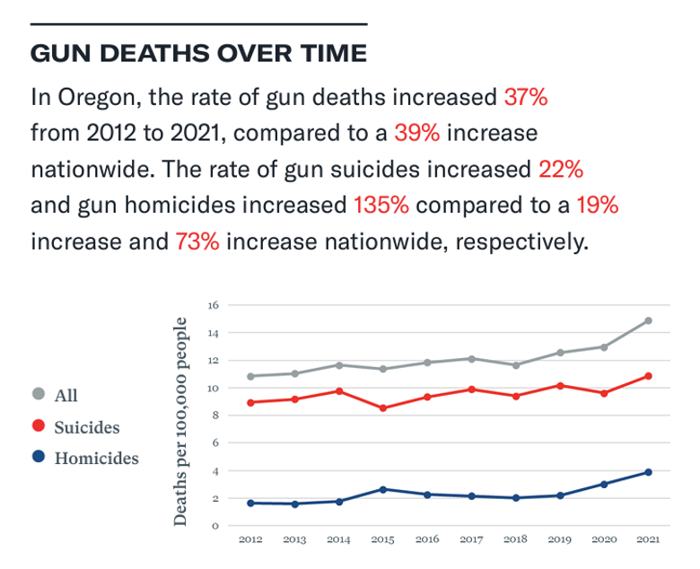
Second, the red-white-blue color scheme is off-putting, as those colors are usually associated with a particular demographic (and not the demographic lobbying for gun control, I’d wager). Third, there is no comparison. I believe this is a correct representation of the data—I don’t think the authors are trying to lie to me—but I can’t tell what the story is. I remade this graph, changing a few major things. I changed the color palette to something softer with less of a political affiliation.
I dropped the “all” category because it didn’t add anything to the graph. I also created a national average for both homicide and suicide, to be a comparison and show what the take-away from this graph was. I added labels to the graph, and an annotation to show what the dots in 2022 meant.
The y-axis is hard to interpret; it is “death per 100,000” but most people, including myself, don’t know how many hundred thousand people live in Oregon (or the United States). So I added an annotation showing what the actual number of deaths were in Oregon in 2022.
line1<- ggplot(
  overview_or, aes(x=year, y=adjusted_rate,
                 color=injury_intent)) +
  geom_line(aes(group=injury_intent)) +
  geom_point(size=2) + labs(x="Year",
                            y="Deaths per 100,000 people",
                            title="Gun deaths in Oregon",
                            subtitle="2012-2022",
                            color="Injury type") +
      scale_x_continuous(breaks=seq(2012, 2022, 2)) +
      theme(panel.background = element_blank()) +
      theme(plot.title = element_text(hjust = 0.5)) +
      theme(plot.subtitle = element_text(hjust = 0.5))
#+
 # annotate('text', x=2021.5, y=16, label="37% increase", size=2.5)

line1 +  scale_color_manual(values = wes_palette("FantasticFox1")[c(2,3)])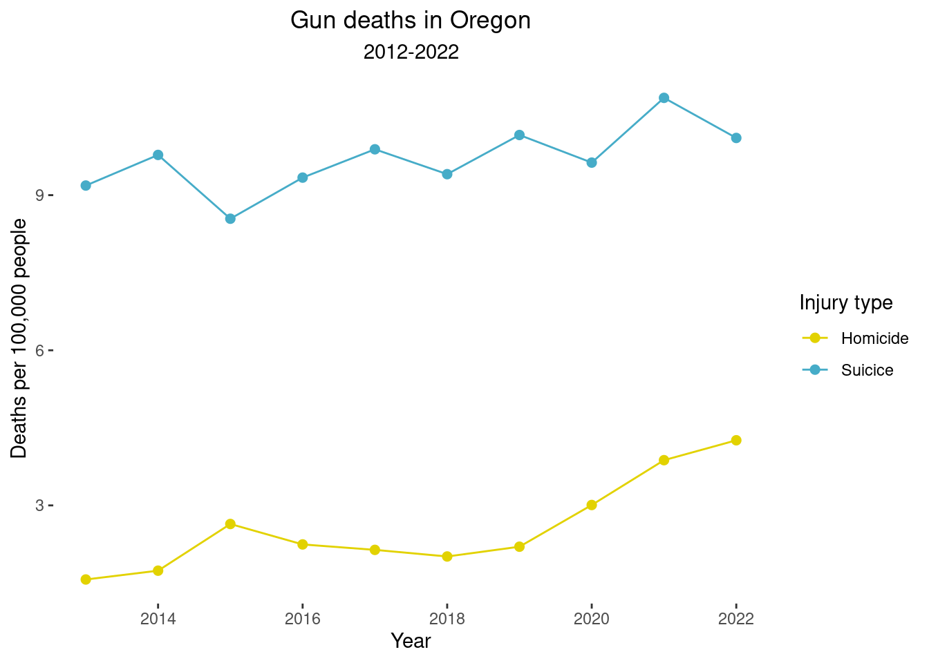
Overlay the national average for suicides and homicides, but removed “all” category.
# need to make a DF with only averages
means <- overview3 %>% group_by(year, injury_intent) %>% summarize(national_av= mean(adjusted_rate, na.rm=TRUE))
## `summarise()` has grouped output by 'year'. You can
## override using the `.groups` argument.means## # A tibble: 30 × 3
## # Groups: year [10]
## year injury_intent national_av
## <dbl> <fct> <dbl>
## 1 2013 All 11.4
## 2 2013 Homicide 3.97
## 3 2013 Suicice 7.83
## 4 2014 All 11.4
## 5 2014 Homicide 3.94
## 6 2014 Suicice 7.76
## 7 2015 All 12.4
## 8 2015 Homicide 4.74
## 9 2015 Suicice 8.01
## 10 2016 All 13.0
## # ℹ 20 more rowsmeans <- means %>% mutate(state="National Average")
means <- means %>% rename(adjusted_rate=national_av)
means <- means %>% filter(injury_intent!="All")
# now make it a DF and bind rows with overview OR
over_means <- bind_rows(x=overview_or, y=means)#over_means "suicide" is spelled wrong
over_means <- over_means %>% mutate(state_intent=case_when(
state=="Oregon" & injury_intent=="Suicice"~ "OR Suicide",
state=="Oregon" & injury_intent=="Homicide"~ "OR Homicide",
state=="National Average" & injury_intent=="Suicice"~ "US Suicide",
state=="National Average" & injury_intent=="Homicide"~ "US Homicide"))
table(over_means$state_intent)##
## OR Homicide OR Suicide US Homicide US Suicide
## 10 10 10 10# Add in Canadian data
ca <- read_excel(here::here("data/canada.xlsx"),
sheet =1,
skip=0,
na = "NA", .name_repair = make_clean_names)
all_means <- bind_rows(over_means, ca)Now graph the OR data including the national average
line2<- ggplot(
  over_means, aes(x=year, y=adjusted_rate,
                 color=state_intent)) +
  geom_line(aes(group=state_intent, color=state_intent)) +
  geom_point(size=1) + labs(x="Year",
                            y="Deaths per 100,000 people",
                            title="Gun Deaths in Oregon vs National Average",
                            subtitle="2013-2022",
                            color="Injury type") +
      scale_x_continuous(breaks=seq(2012, 2022, 1)) +
    scale_y_continuous(breaks=seq(0,12,2)) +
      theme(panel.background = element_blank()) +
      theme(plot.title = element_text(hjust = 0.5)) +
      theme(plot.subtitle = element_text(hjust = 0.5)) +
  theme(legend.position="none")
line2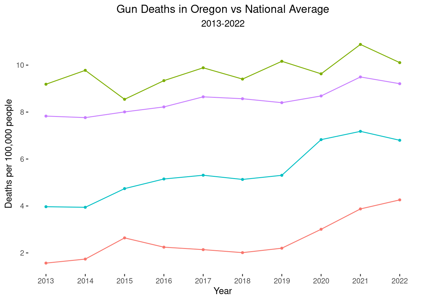
#+
 # annotate('text', x=2021.5, y=16, label="37% increase", size=2.5)
Try other colors.
line2 + scale_color_manual(values = wes_palette("Moonrise3")[c(1,2,3,5)]) +  annotate('text', x=2015, y=10, label="Oregon suicide", size=3, color="pink3")  +
  annotate('text', x=2015, y=7.5, label="US suicide", size=3, color="darkkhaki") +
  annotate('text', x=2018, y=6, label="US homicide", size=3, color="olivedrab") +
  annotate('text', x=2020, y=2, label="OR homicide", size=3, color="darkturquoise")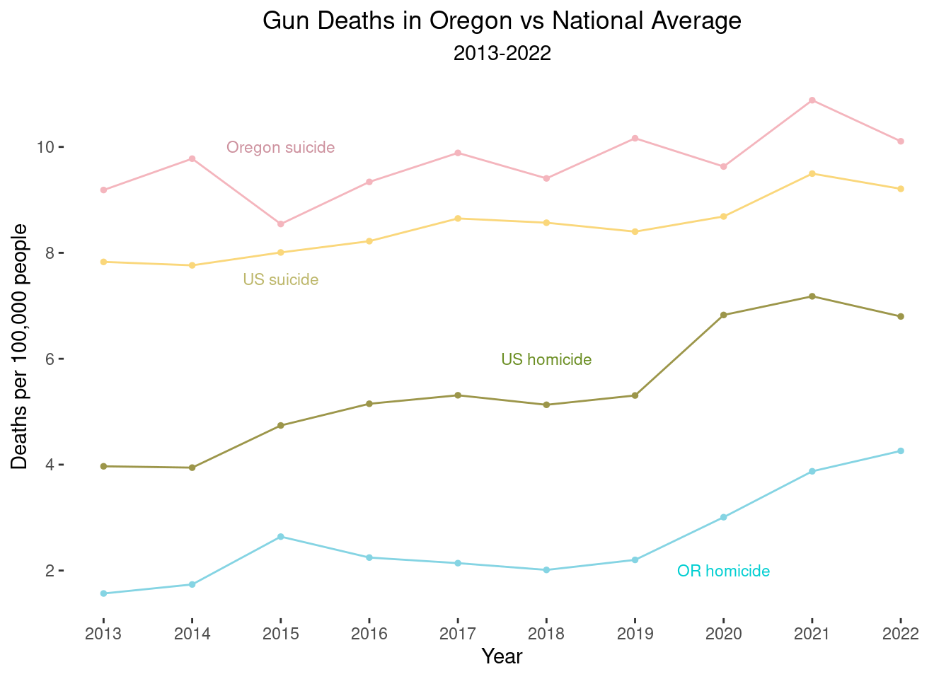
line2 + scale_color_manual(values = wes_palette("GrandBudapest2")[c(1,3,2,4)]) +
 annotate('text', x=2015.25, y=10,
          label="Oregon suicide", size=4, color="rosybrown3")  +
  annotate('text', x=2015, y=7.5,
           label="US suicide", size=3, color="cornflowerblue") +
  annotate('text', x=2018, y=6,
           label="US homicide", size=3, color="lightskyblue3") +
  annotate('text', x=2020, y=2,
           label="OR homicide", size=3, color="lightpink3") +
  annotate('text', x=2021.75, y=11,                                                           label="*462 deaths", size=3, color="rosybrown3") +
  annotate('text', x=2022, y=9.92,
           label="*", size=7, color="black")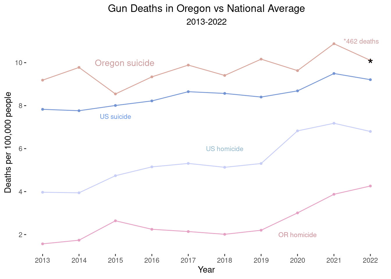
Actually I like the more primary colors better:
# suicide rate in US in 2022
# population of US:
9.208292*3333
## [1] 30691.24line2 + scale_color_manual(values = wes_palette("Moonrise3")[c(1,2,3,5)]) + annotate('text', x=2015, y=10, label="OR suicide", size=4, color="pink3") +
annotate('text', x=2015, y=7.5, label="US suicide", size=3, color="darkkhaki") +
annotate('text', x=2018, y=6, label="US homicide", size=3, color="olivedrab") +
annotate('text', x=2018, y=2.75, label="OR homicide", size=3, color="darkturquoise") +
annotate('text', x=2021.75, y=11, label="477 deaths", # OR suicide #
size=3, color="pink3") +
annotate('text', x=2022, y=9.92,
label="*", size=7, color="black") +
annotate('text', x=2021.75, y=3.4, label="176 deaths",
size=3, color="darkturquoise") + # OR homicide
annotate('text', x=2022, y=4,
label="*", size=7, color="black") 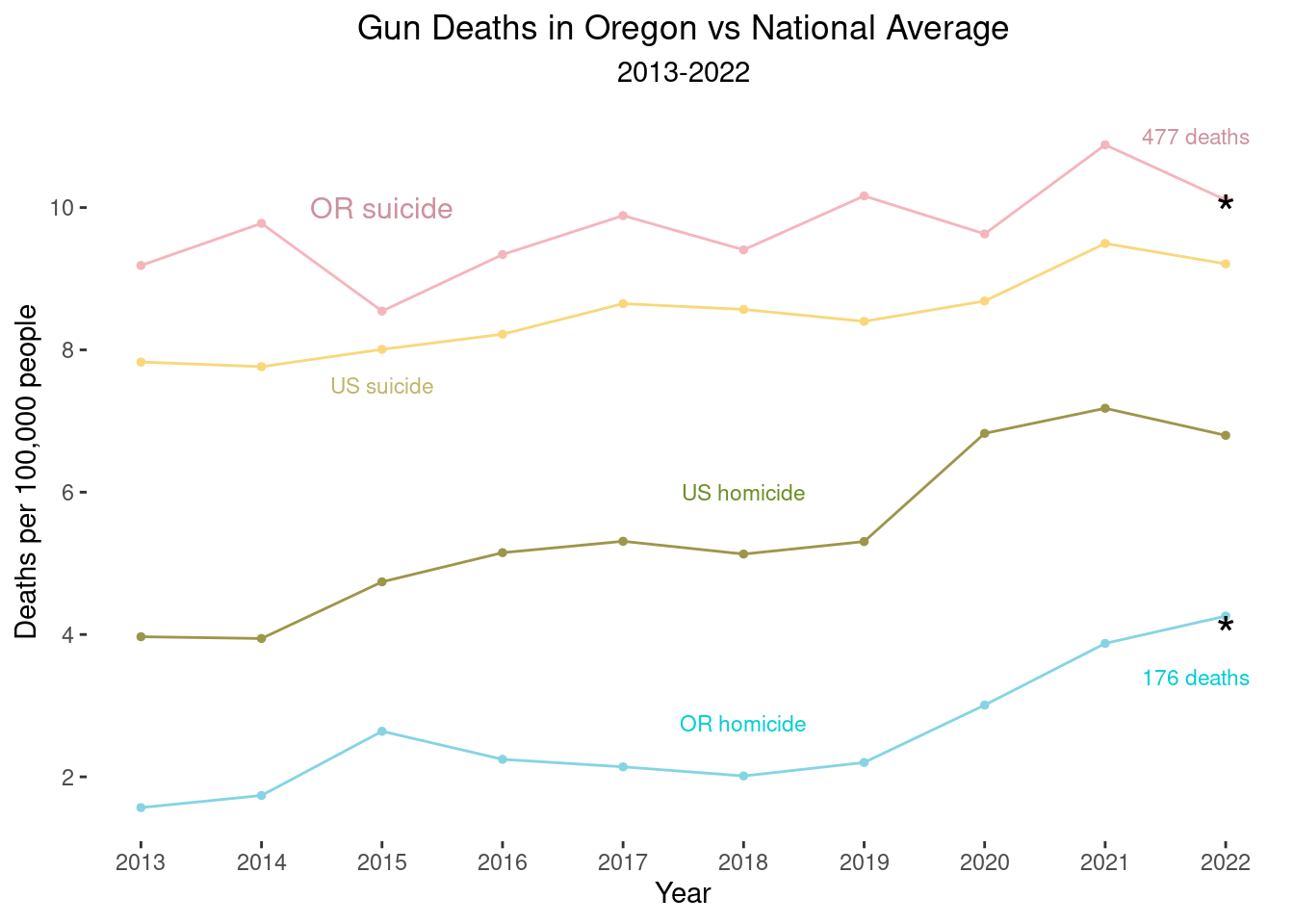
Final version:
line2 + scale_color_manual(values = wes_palette("Royal2")[c(2,3,1,5)]) +  annotate('text', x=2015, y=10, label="OR suicide", size=4, color="lightpink1")  +
  annotate('text', x=2015, y=7.5, label="US suicide", size=3, color="paleturquoise4") +
  annotate('text', x=2018, y=5.75, label="US homicide", size=3, color="khaki4") +
  annotate('text', x=2018, y=2.60, label="OR homicide", size=3, color="rosybrown3")  +
  annotate('text', x=2021.75, y=11,                                                           label="477 deaths", # OR suicide #
           size=3, color="lightpink1") +
  annotate('text', x=2022, y=9.92,
           label="*", size=7, color="black") +
  annotate('text', x=2021.75, y=3.4,                                                           label="176 deaths",
           size=3, color="rosybrown3") + # OR homicide
  annotate('text', x=2022, y=4,
label="*", size=7, color="black") 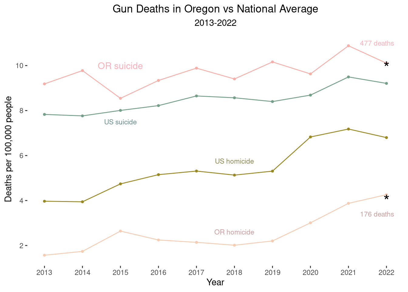
Here, I hope the readers can see (pre-attentionally) the story the graph is showing: Oregon suicide rates are higher than the national average, and Oregon homicide rates are much lower than the national average. Apparently, Oregon is doing well in trying to prevent interpersonal firearm violence but is not doing well at preventing suicide by firearm. I made an additional version of the graph, adding to the graph the average in Canada (combined across all provinces).
Now include Canada:
caption_line <- "CA, Canada. OR, Oregon, US, United States."

line3<- ggplot(
  all_means, aes(x=year, y=adjusted_rate,
                 color=state_intent)) +
  geom_line(aes(group=state_intent, color=state_intent)) +
  geom_point(size=1) + labs(x="Year",
                            y="Deaths per 100,000 people",
                            title="Gun Deaths in Oregon 2013-22",
                            subtitle="Vs. Average in US & Canada",
                            color="Injury type", caption=caption_line) +
      scale_x_continuous(breaks=seq(2012, 2022, 1)) +
    scale_y_continuous(breaks=seq(0,12,2)) +
      theme(panel.background = element_blank()) +
      theme(plot.title = element_text(hjust = 0.5)) +
      theme(plot.subtitle = element_text(hjust = 0.5)) +
  theme(legend.position="none")
line3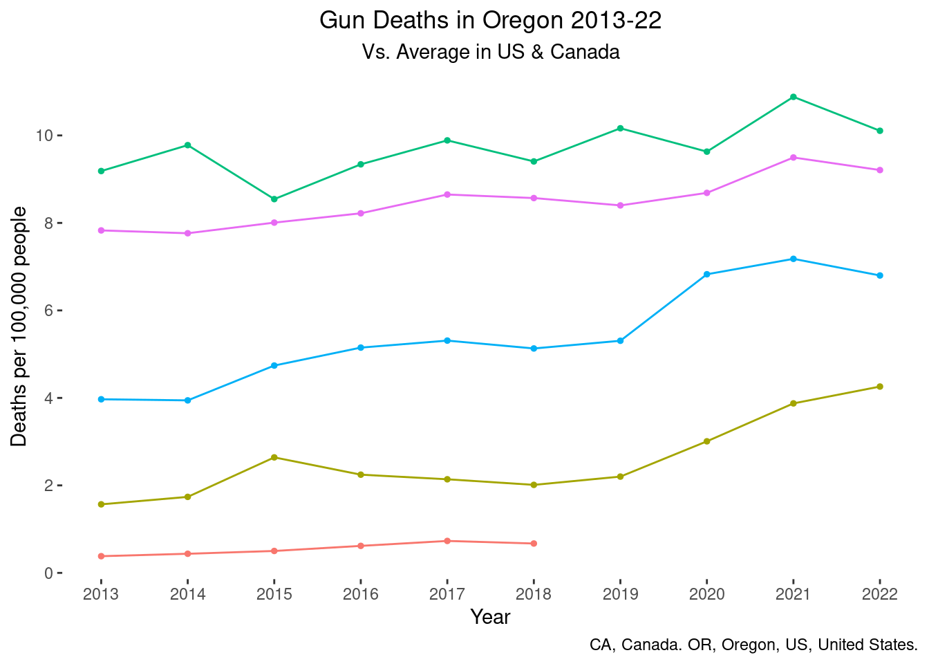
Final version including Canada:
line3 + scale_color_manual(values =
                             wes_palette("Darjeeling1")[c(3,4,1,2,5)]) +  annotate('text', x=2015, y=10, label="OR suicide", size=4, color="firebrick2")  +
  annotate('text', x=2015, y=7.5, label="US suicide", size=3, color="deepskyblue3") +
  annotate('text', x=2018, y=5.75, label="US homicide", size=3, color="aquamarine4") +
  annotate('text', x=2018, y=2.60, label="OR homicide", size=3, color="orange3")  +
  annotate('text', x=2021.75, y=11,                                                           label="477 deaths", # OR suicide #
           size=3, color="firebrick2") +
  annotate('text', x=2022, y=9.92,
           label="*", size=7, color="black") +
  annotate('text', x=2021.75, y=3.4,                                                           label="176 deaths",
           size=3, color="orange3") + # OR homicide
  annotate('text', x=2022, y=4,
           label="*", size=7, color="black") +
annotate('text', x=2019, y=0.6, label="CA homicide", size=3, color="orange2") 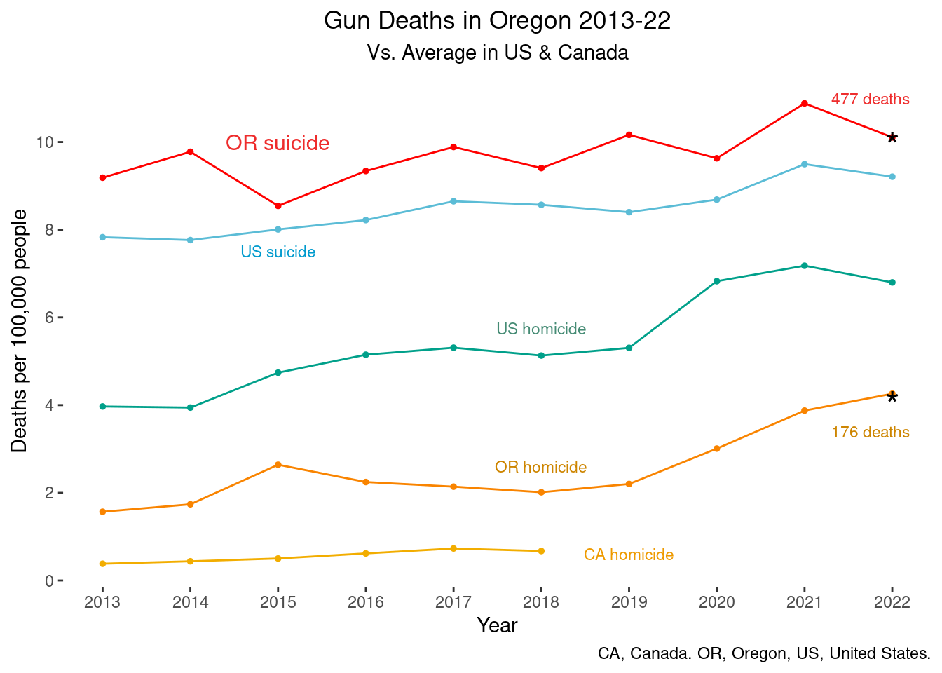
From the version, I hope the reader can see the difference between suicide and homicide in Canada, Oregon, and the US average (I could only find data on Canadian homicide, not suicide). I chose to use color to help differentiate– in the first version, I made both Oregon lines pink and the US lines blue and green to help differentiate them. In terms of visual primitives, I didn’t change anything from the original line graph but now we have the height of the lines to compare, which should be easy to see. The annotations should hopefully be easier to read than a legend, and the additional annotations with the total number of deaths should hopefully make it easier to interpret and digest the information.
Visualization 2: Pie chart
For the second visualization I choose a pie chart. We talked in class about visual primitives and how area and length are poor visual primitives, in that the eye generally can’t tell small or medium differences in area or length. I also felt the picture lacked context, like visualization #1. The text above the graphic talks about the differences between Oregon and the US as a whole, but the graphic doesn’t show this comparison.
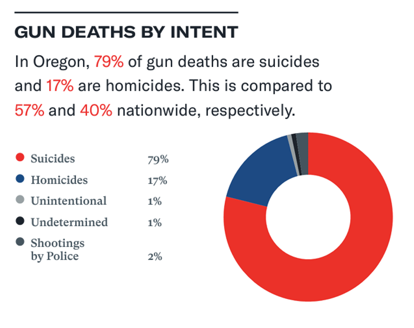
I still find the American flag color theme off-putting, and it’s hard to distinguish between the different grey colors.
To create a new way to visualize these data, I made a stacked bar chart. I created a national average for the same categories and compared this to Oregon.
Wrangle data
table(overview2$injury_intent)##
## All Firearm Deaths Firearm Homicide
## 52 52
## Firearm Suicide Shootings by Police
## 52 52
## Undetermined Firearm Death Unintentional Firearm Death
## 53 52overview2 <- overview2 %>% select(-first_year) %>% select(-last_year)
overview2 <- overview2 %>% mutate(injury_type=case_when(
injury_intent=="Firearm Suicide" ~ "Suicide",
injury_intent=="Firearm Homicide" ~ "Homicide",
injury_intent== "Shootings by Police" ~ "Shootings by Police",
injury_intent=="Unintentional Firearm Death" ~ "Unintentional",
injury_intent=="Undetermined Firearm Death" ~ "Undetermined")) %>% mutate(injury_type=as.factor(injury_type))
table(overview2$injury_type)##
## Homicide Shootings by Police Suicide Undetermined
## 52 52 52 53
## Unintentional
## 52overview2b <- overview2 %>% filter(!is.na(injury_type))overview2b <- overview2b %>% select(-population) %>% select(-age_adjusted_rate_per_100_000)
overview2b <- overview2b %>% select(-injury_intent)
# create means
pie_means <- overview2b %>%
group_by(injury_type) %>% dplyr::summarize(
total_deaths_number=mean(total_deaths_number, na.rm=TRUE))
pie_means## # A tibble: 5 × 2
## injury_type total_deaths_number
## <fct> <dbl>
## 1 Homicide 3399.
## 2 Shootings by Police 126.
## 3 Suicide 4847.
## 4 Undetermined 95.5
## 5 Unintentional 117.# wrangle
pie_means <- pie_means %>% mutate(state="National Average")
total_deaths<-3398.6538+125.8667+4847.1154+95.5122+117.4762
total_deaths## [1] 8584.624pie_means <- pie_means %>% mutate(percent=total_deaths_number/total_deaths)
pie_means_or <- overview2b %>% filter(state=="Oregon")
total_or <- 2329 + 21 + 21 + 555 + 76
pie_means_or <- pie_means_or %>% mutate(percent= total_deaths_number/total_or)
# bind rows
new_pie <- bind_rows(pie_means, pie_means_or)
new_pie <- new_pie %>% mutate(percent=percent*100)First version: stacked bar chart
stack <- ggplot(new_pie, aes(x=state, y=percent, fill=injury_type)) + geom_col()
stack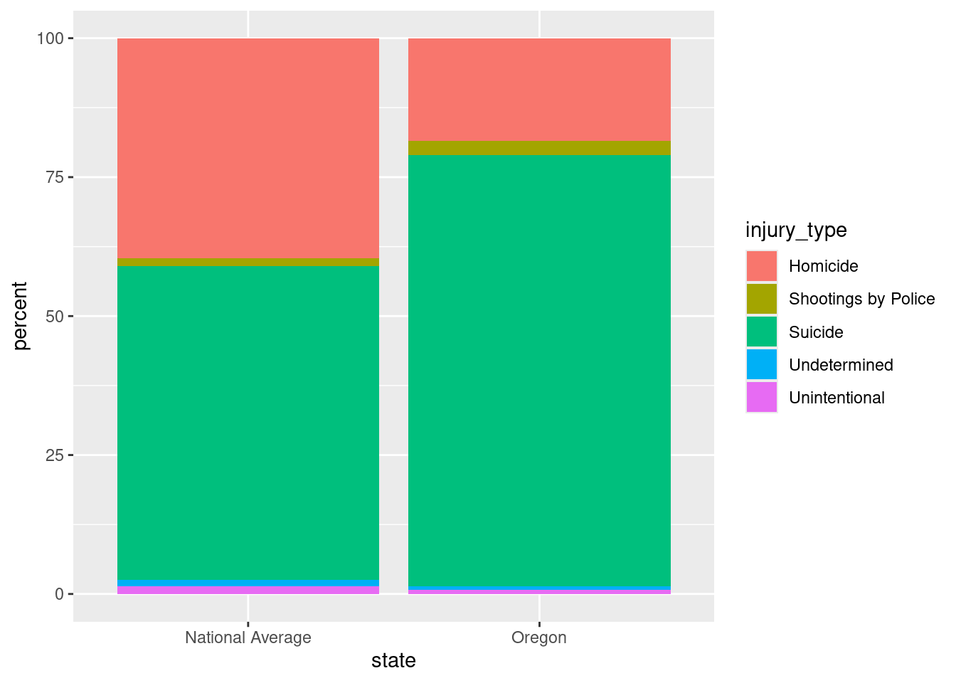
stack + theme(panel.background = element_blank()) +
    theme(legend.title=element_blank()) +
  labs(x="", y="Percent of total firearm deaths", title="Firearms deaths by type", subtitle="Oregon vs. US Average") + scale_fill_cosmic("signature_substitutions")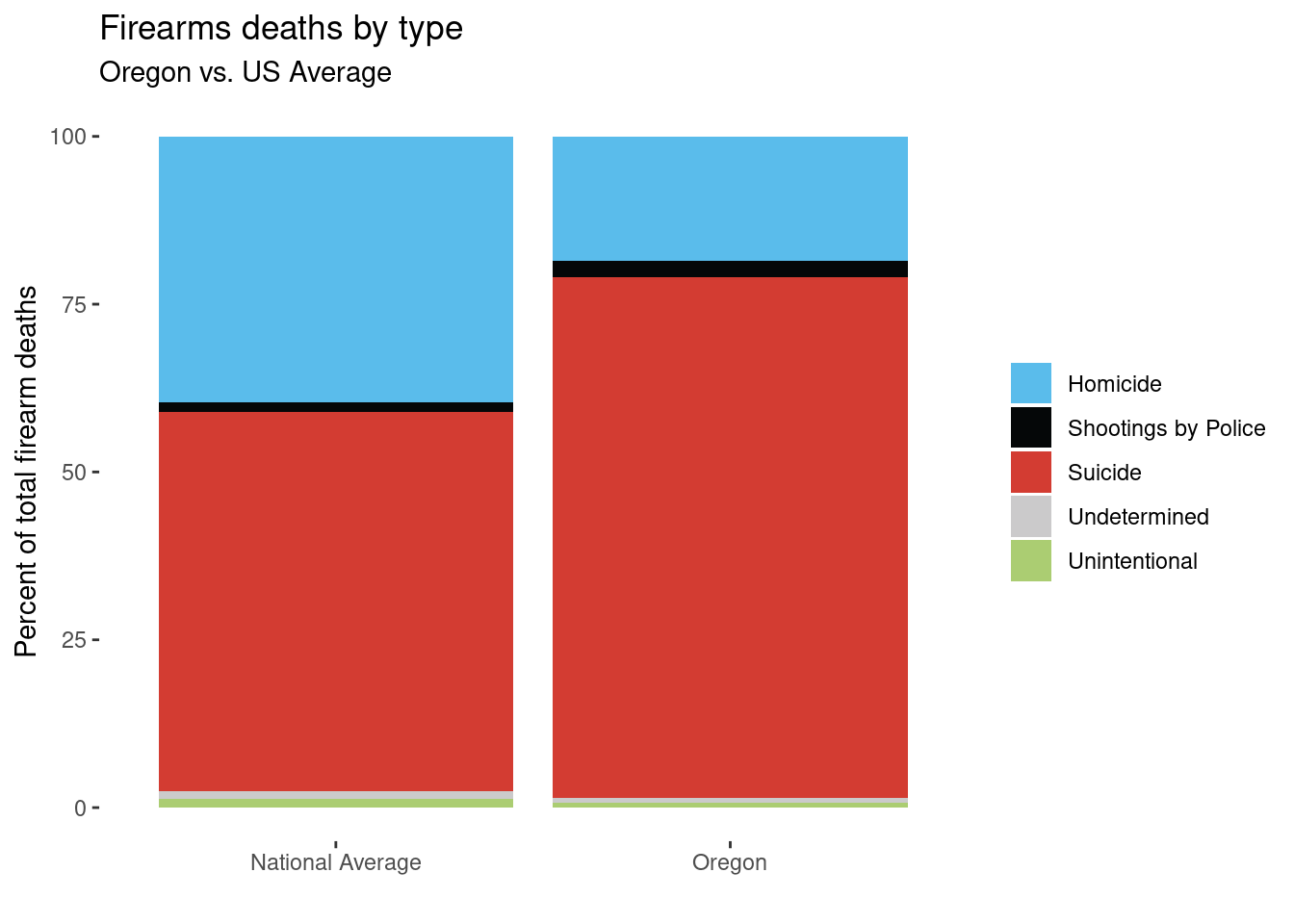
Final version: stacked bar chart
stack + theme(panel.background = element_blank()) +
    theme(legend.title=element_blank()) +
  labs(x="", y="Percent of total firearm deaths", title="Firearms deaths by type", subtitle="Oregon vs. US Average") +
scale_fill_npg() + theme(plot.title = element_text(hjust = 0.5)) + theme(plot.subtitle = element_text(hjust = 0.5)) 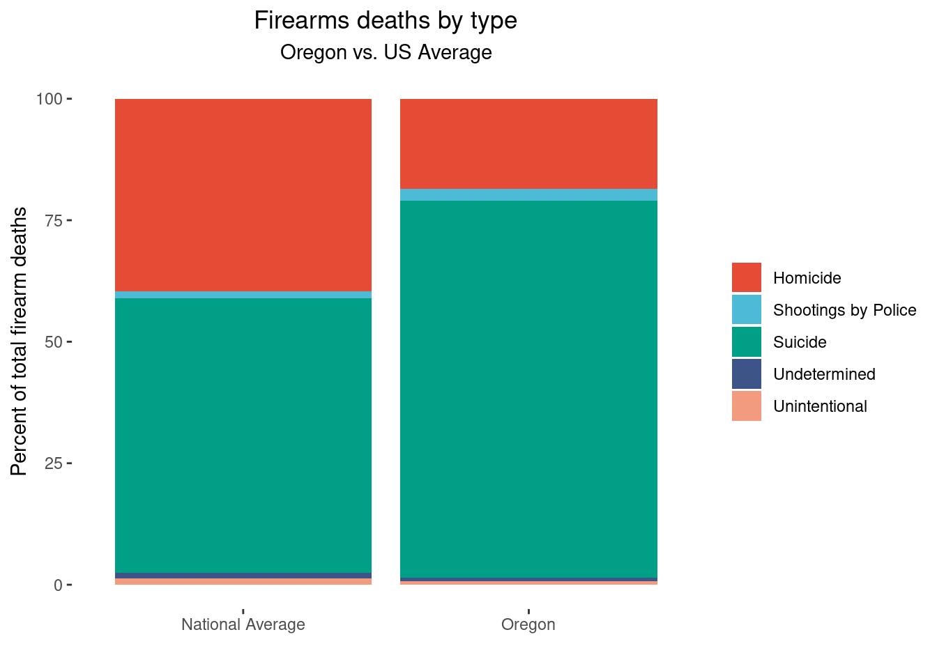
In this stacked bar chart, I hope it’s obvious to the reader that Oregon has a higher proportion of suicide than the national average.
Visualization 3: bar chart
Old visualization:
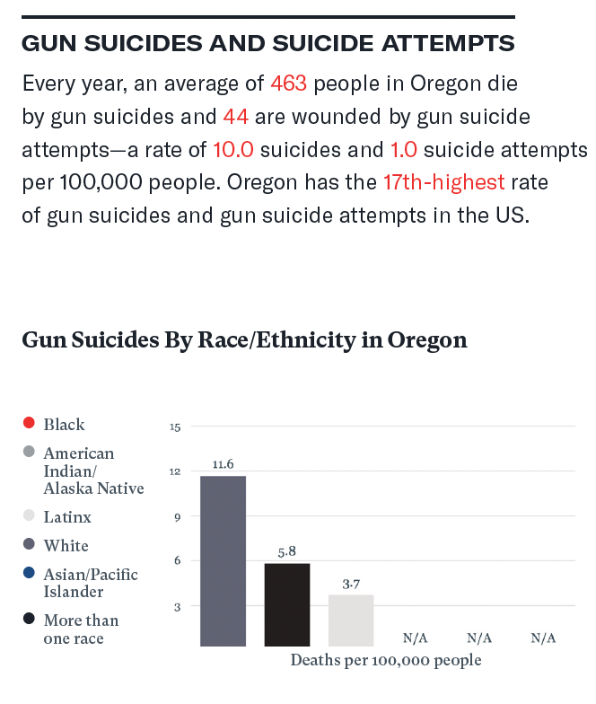
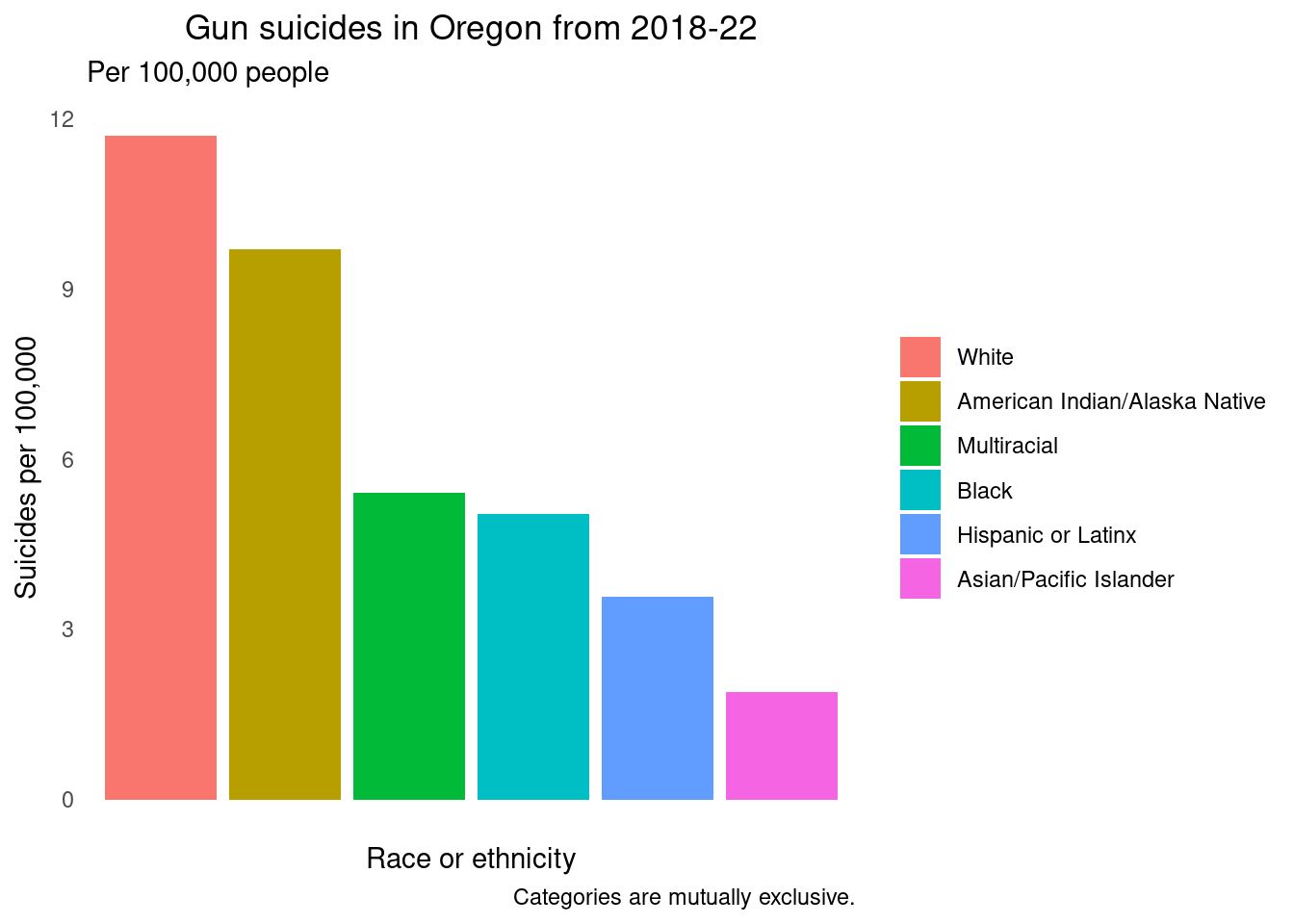
My criticisms of this visualization were numerous. First and most importantly, they used a black and white gradient color scheme for race! This is confusing and problematic. Not only that, but they have the “Black race” category as bright red (and it’s not even displayed on the graph). There are many N/A’s on the graph, and not all the categories in the legend are shown on the graph, with no explanation. There is no context (ie year) for these data. Also, there is inconsistent use of decimal points used in the text above the bar chart, perhaps because the authors wanted to stress that people come in discrete units. Usually, researchers will choose a number of significant figures to use and use this across all tables and graphs.
Also problematic was the categorization of race and ethnicity. Per the National Institutes of Health (NIH), race and ethnicity should always be categorized and presented separately since they are not interchangeable; a person has a race and an ethnicity. However, these categories are presented as though they are mutually exclusive. The first step I took was to try to figure out why there were so many N/As in the data. I believe it is because the complete gun suicides and the gun suicide attempts were combined, and not every state collected this data. I decided to visualize only the completed gun suicides because every state collected this data, and this prevented the issue of having so many categories of N/A.
The basic bar chart include 6 categories, which I believe were mutually exclusive. I chose a default color palette that didn’t have black and white, or a gradient that unintentionally suggest something.
Wrangle data
demo_or <- demo %>% filter(state=="Oregon")

demo_or <- demo_or %>% filter(injury_intent=="Firearm Suicide")
table(demo_or$race_ethnicity)
##
## All Races/Ethnicities
## 3
## American Indian/Alaska Native (non-Hispanic)
## 3
## Asian/Pacific Islander (non-Hispanic)
## 3
## Latinx
## 3
## More than one race
## 3
## non-Hispanic Black
## 3
## non-Hispanic white
## 3demo_or <- demo_or %>% filter(gender=="All Genders")
demo_or <- demo_or %>% mutate(percent =total_deaths_number /2329 )
demo_or <- demo_or %>% mutate(percent =percent*100)
demo_or <- demo_or %>% mutate(adjusted_rate=age_adjusted_rate_per_100_000)
demo_or <- demo_or %>% filter(race_ethnicity!="All Races/Ethnicities")bar <- ggplot(demo_or, aes(x=race_ethnicity, y=adjusted_rate)) + geom_col(aes(fill=race_ethnicity)) + labs(x="Race or ethnicity", y="Suicides per 100,000", title="Gun suicides in Oregon by race and ethnicity", subtitle="Per 100,000 people")
bar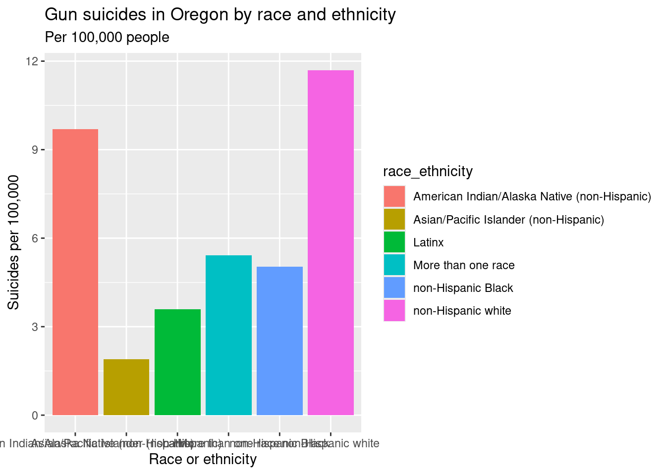
table(demo_or$race_ethnicity)##
## American Indian/Alaska Native (non-Hispanic)
## 1
## Asian/Pacific Islander (non-Hispanic)
## 1
## Latinx
## 1
## More than one race
## 1
## non-Hispanic Black
## 1
## non-Hispanic white
## 1# relevel the factors
demo_or <- demo_or %>% mutate(race_ethnicity=forcats::fct_recode(race_ethnicity, # new name = old name
"American Indian/Alaska Native"= "American Indian/Alaska Native (non-Hispanic)",
"Asian/Pacific Islander" ="Asian/Pacific Islander (non-Hispanic)",
"Multiracial"= "More than one race",
"Black" = "non-Hispanic Black",
"Hispanic or Latinx"= "Latinx",
"White" = "non-Hispanic white"))
# now put them in alphabetical order
demo_or <- demo_or %>% mutate(race_ethnicity=forcats::fct_relevel(race_ethnicity,
"American Indian/Alaska Native",
"Asian/Pacific Islander",
"Black",
"Hispanic or Latinx",
"Multiracial",
"White"))
demo_or %>% pull(race_ethnicity) %>% levels()## [1] "American Indian/Alaska Native" "Asian/Pacific Islander"
## [3] "Black" "Hispanic or Latinx"
## [5] "Multiracial" "White"table(demo_or$race_ethnicity)##
## American Indian/Alaska Native Asian/Pacific Islander
## 1 1
## Black Hispanic or Latinx
## 1 1
## Multiracial White
## 1 1First version, new bar chart
caption <- "Categories are mutually exclusive."
bar <- ggplot(demo_or, aes(x=race_ethnicity,
y=adjusted_rate)) + geom_col(aes(fill=race_ethnicity)) +
labs(x="Race or ethnicity",
y="Suicides per 100,000",
title="Gun suicides in Oregon from 2018-22",
subtitle="Per 100,000 people",
caption=caption)
bar + theme(axis.text.x=element_blank()) +
theme(panel.background = element_blank()) +
theme(plot.title = element_text(hjust = 0.5)) +
theme(legend.title=element_blank()) +
theme(axis.text.x = element_blank(),
axis.ticks = element_blank()) 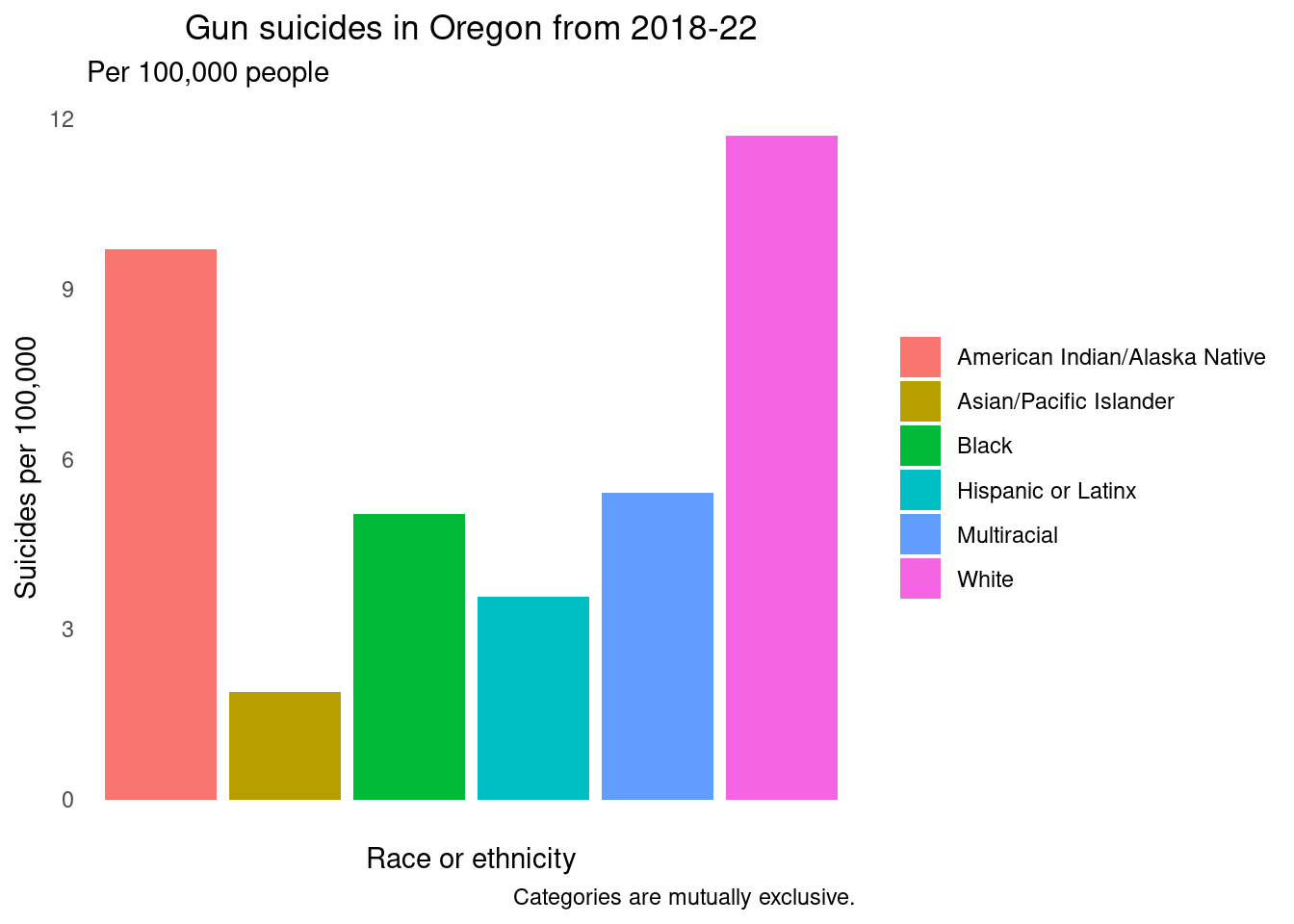 This new version has a simple color scheme, and a note explaining that
the categories are mutually exclusive. The race and ethnicity categories
are in alphabetical order.
I also made a version of this graph where the categories were in descending order. I felt this was more intuitive and easier to interpret without looking back and forth from the legend to the graph.
test<- demo_or %>% mutate(race_ethnicity=fct_relevel(race_ethnicity,
                   "White",
                  "American Indian/Alaska Native",
                  "Multiracial",
                  "Black",
                  "Hispanic or Latinx",
                  "Asian/Pacific Islander"))
caption <- "Categories are mutually exclusive."
bar <- ggplot(test, aes(x=race_ethnicity,
y=adjusted_rate)) + geom_col(aes(fill=race_ethnicity)) +
labs(x="Race or ethnicity",
y="Suicides per 100,000",
title="Gun suicides in Oregon from 2018-22",
subtitle="Per 100,000 people",
caption=caption)
bar + theme(axis.text.x=element_blank()) +
theme(panel.background = element_blank()) +
theme(plot.title = element_text(hjust = 0.5)) +
theme(legend.title=element_blank()) +
theme(axis.text.x = element_blank(),
axis.ticks = element_blank()) 