Figures
As part of a class on data visualization in R, I made the following data visualizations:
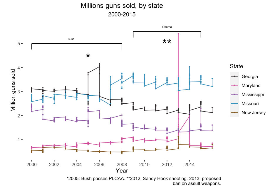
- A graph showing gun sales with respect to several pieces of gun control legislation.
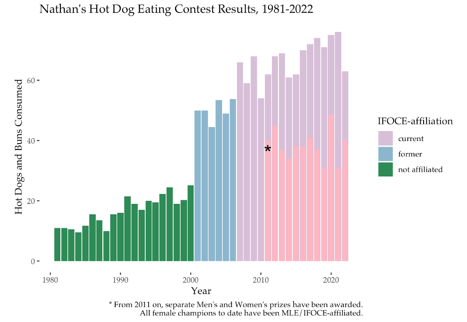
- A graph with the results from a hot dog eating contest.
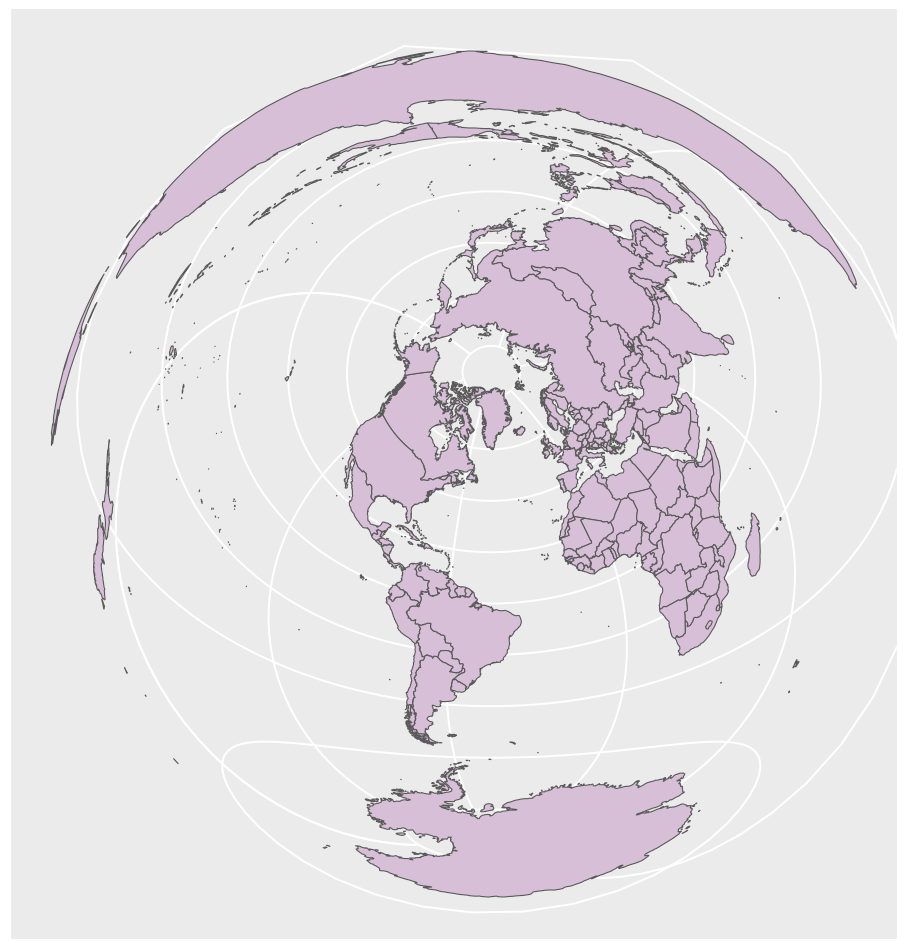
- A world map.
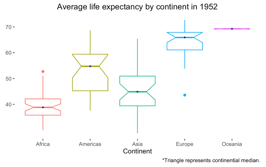
- A box plot of life expectancy across the continents.
- A graph of the Portland neigborhood coalitions.
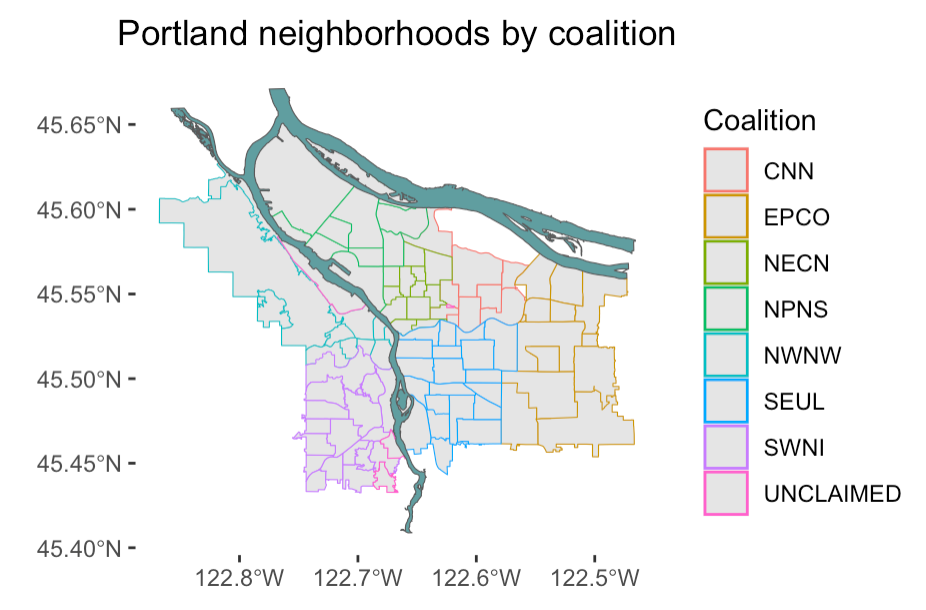
These are: 1. CNN: Central Northeast Neighborhood District 2. EPCO: East Portland Community Office 3. NECN: Northeast Coalition of Neighborhoods 4. NPNS: North Portland Neighborhood Services 5. NWNW: Neighbors West Northwest 6. SEUL: Southeast Uplift 7. SWNI: Southwest Neighborhood District 8. Unclaimed areas